Published on : Wednesday, September 13, 2017
 Nendo has just finished a renewal project to celebrate the 10th anniversary of the organic cosmetic brand “naturaglacé”. The brand value lies in raw materials which are of 100% natural origin. The products, manufactured in Japan, are safe to use and gentle enough even for a baby’s skin. However, there was an issue that those strengths and characteristics were vague.
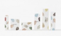
To communicate the brand value and its strengths, 11 colours found in nature that are related to the raw materials in the products have been used. Brush patterns of these colours were randomly applied to the packaging, and by modifying the size and layout of the patterns, each package now has a unique expression.
There are 10 patterns of the colour palette, to distinguish the different categories of products. Warm grey with a matte finish was chosen as the base colour of the containers, to avoid halation of the soft colours on the outer box. Compact cases for foundation and colour items in the series have a slightly hollowed indent on the edge, evoking the image of a painter’s palette with a dent to hook the fingers.
In this way, by borrowing nature’s gifts and applying them on oneself as if a watercolor artist would paint a canvas, a design about the pleasure of applying makeup was accomplished.
Tags: brand identity, brand image, colours, cosmetic brand, natural, NENDO, patterns, products, raw materials
|